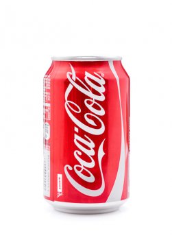
 Would The Coca-Cola Company’s success story have differed if its trademark color had been green instead of red?
Psychology suggests that it would have. In fact, according to research, the red used in Coca-Cola's color scheme was the perfect color for the medicine-turned-softdrink-company to use, since red has the added effect of making customers feel energetic and excited. Energy was the core emotion Coca-Cola's marketers wanted their audience to feel when thinking about a refreshing, caffeinated drink, and making the brand red was a simple strategy that paid off.
Web design: Where art meets marketing
Web designers and brand managers have long used color psychology in their workflow, particularly as it relates to how color affects consumer perceptions of a product or brand. From a marketing standpoint, influencing a large portion of people to feel a certain emotion based on something as simple as the color of a website, or a product’s labeling and packaging, is a no-brainer. Add to that the individual customization and identity that color allows and it’s easy to see why color and marketing go together like proverbial (green) peas in a pod.
One of the most comprehensive empirical studies on the topic was published in 2011 in the Academy of Marketing Science. The study was titled “Exciting red and competent blue: The importance of color in marketing, ” and in it, researchers Labrecque and Milne collected data that statistically verified the following fascinating facts about color psychology.
#1) White, yellow and pink are perceived as sincere and pure
 Although their study found data that supported this hypothesis well, Labrecque and Milne weren’t the only researchers who have attempted to prove that humans associate sincerity with these three colors. Three prior studies had already shown that white is associated with clarity, purity and peace [1] [2] [3]. Move toward the yellows, and researchers found that the feeling adjusts slightly to the same element of sincerity, but combines happiness and optimism [4]. Pink is tied to emotions like sincerity and softness, as well, with a hint of nurturing and warmth [1].
Crowdfunding resources like Gofundme.com and Indiegogo.com use large areas of white in their website's design, perhaps to influence would-be benefactors that the projects they are funding are sincere campaigns.
#2) Red, orange and yellow induce energy and excitement
Since the 60s, researchers involved in color psychology have found links between the color red and excitement. Activity, stimulation, energy – all of those feelings that get your heart racing – that’s the emotional effect most people experience when seeing the color red. In fact, the colors with longer wavelength hues like red, orange and deep yellow all have a similar effect of producing emotions of extroversion, energy and excitement. If you want a lot of energy, red is the ticket. For a good middle ground, orange works. And while the least energetic of the three, yellow still brings a burst of energy that other colors beyond these three just can’t match.
#3) Brown and blue show competence
If competence and earning clients’ trust are your primary business goals, research shows that blue is the color that relays that exact message [5]. Brown is also a suitable color for relaying similar emotions like reliability and seriousness, and both colors together pack a one-two punch of a reliable, professional vibe [1] [4].
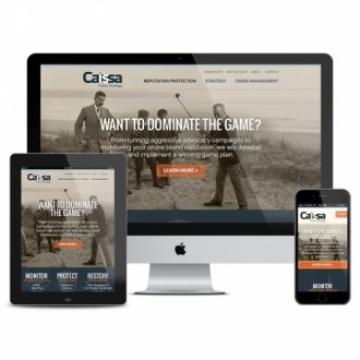
Consider the website redesign of one of RocketFuel's clients, Caissa, a Memphis-based Public Strategy and reputation management company. We chose a palette of blues and browns to reflect the goals of reliability and trust that were the foundations of the client's core philosophy.
#4) Saturation shows strength and ruggedness
Saturation is the amount of pigment in a color, and is measured on a scale of low saturation (which appears washed out) and high saturation (which appears to have vivid color). Prior research showed that the more saturated a color appears, the more it elicits feelings of dominance, ruggedness and strength [6]. Labrecque and Milne's study also found evidence that backed up that claim, demonstrating that consumers perceived logos and products using low-saturation, washed-out colors as reflecting softness and lacking in ruggedness.
Sources
[1] Fraser, T., & Banks, A. (2004). Designer’s color manual: The complete guide to color theory and application. San Francisco: Chronicle Books.
[2] Mahnke, F. H. (1996). Color, environment, and human response. New York: Reinhold.
[3] Wright, A. (1988). The beginner’s guide to colour psychology. London: Colour Affects Ltd.
[4] Clarke, T., & Costall, A. (2007). The emotional connotations of color: a qualitative investigation. Color Research and Application, 33 (5), 406–410.
YOU MIGHT ALSO LIKE